James Barnes & Sean Fitzsimons – Campaigns that make the headlines
Available on Spotify and Apple Podcasts
About James and Sean
James Barnes and Sean Fitzimons started working at Verve Search on the same day. Initially they worked in outreach, and over time they started getting more involved in ideation.
Eventually, they both moved over to creative lead roles, with a greater focus on generating content ideas. And they’ve been responsible for some of the agency’s most successful campaigns.
Sean is now Creative Director at Verve. And James recently moved to NeoMam Studios where he’s Creative Lead.
What I found most intriguing and valuable in this conversation is the level of detail we get into – about what it takes to create a great campaign.
It’s clear that they both think really deeply about what makes an idea work. And it’s surely this level of thought that makes them both so excellent at what they do.
It was an absolute pleasure to chat to them – I learned a ton! And I can’t wait to have them on the show again.
What we cover in this episode…
We start off talking about…
- How focusing on the content as the end product of ideation – instead of the journalist’s story – is an easy trap to fall into
- How Sean thinks of ideas as having a two-stage sign-off process
- How it’s easy to lose track of the headline when you’re surrounding yourself with a big shiny campaign
Their favourite campaign that didn’t work – and the importance of a clearly articulated headline
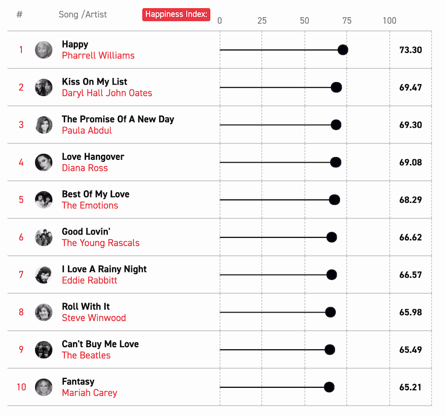
The campaign reveals the happiest and saddest songs throughout the history of the Billboard charts.
Here, we discuss…
- How they borrowed the methodology from ‘the most depressing Radiohead song’ – measuring the valence of the songs from the Spotify API and sentiment analysis of the lyrics
- How they got too lost in the methodology
- A similar piece on the BBC that simply looks at the Spotify data (without sentiment analysis of the lyrics) to determine the happiest and saddest number ones
At one point, by way of comparison, James mentions a popular methodology that looks at the most common songs appearing in Spotify playlists which can reveal things like the most popular songs to clean the house to.
As another point of comparison, I mention the Expedia Playlister piece from the team at Verve which looked at the most hipster and mainstream songs of all time – a great example of a well-articulated headline.
How to turn a game into a story
Colour is in the eye of the beholder is an embeddable interactive game for Lenstore that determines your ability to perceive different shades (or hues) of colour.
Sean mentions how both he and his colleague at the time, Matt Lindley, had come up with different ideas about colour perception. And the final campaign came from more than one idea that they brought together.
In this section, we discuss…
- How they surveyed the general public and asked them questions that were already backed by scientific research
- How the amount of research around colour perception led Sean to believe it was an interesting topic
- How the piece appealed to tabloid press by challenging the reader with headlines like CAN you pass this test
- How the content also appealed to Pop Science sites because it gave them an opportunity to talk about the survey data and the pre-existing science
- How they noticed a lot of analytical referrals from a photography website, and realised there was an element of social currency in sharing the game – it allowed people to boast about their scores
- The value of considering whether people will look good sharing the content
I mention a similar game that tests designers’ kerning skills.
I mention that I really like pieces that can tell people something real about themselves. Not things like ‘Which Star Wars character are you?’ but things like how well you can keep rhythm, how fast your reaction times are, what speed you can read, etc.
The team at Verve ended up doing a bunch of these ampaigns for Lenstore including a photographic memory test, and one that looks at your tendency to see faces in objects (like clouds, for example) – a phenomenon called pareidolia.
They also did an interactive version of the perpetually popular ‘Can you spot it?’ campaigns.
How data-driven content doesn’t have to look like data
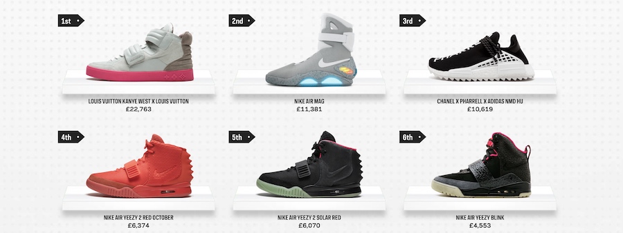
Specifically, we talk about the Crep Check campaign the team created for Farfetch, which looks at the most valuable sneakers available on the market.
Here we discuss…
- The importance of considering the types of visuals specific audiences and journalists are accustomed to seeing
- How they wanted the content to look like something you might see in GQ or Cosmo
- How previous success with Comic Gains and Hot Wheels gave them confidence in this approach
- How the campaign worked for lifestyle and tabloid press, but also offered finance and investment angles
How James uses TweetDeck for outreach
Here, James tells us…
- How he sets up TweetDeck as alerts for the different keywords related to the campaign he’s outreaching
- How he used this to pitch a story about Daniel-Day Lewis retiring as the most bankable Brit
- Why you need to be on the lookout for breaking stories relevant to the campaign if you’re to take advantage of them – because there’s only a short window
- How tying the campaign to a breaking story can give the journalists a reason to write about the campaign NOW
We then go on to discuss…
- What ideation sessions look like at Verve
- The balance between ideating on your own and bouncing ideas and themes around with others
- How a good idea is one that people can immediately add to, they’ve got something to say (I think I got this from the book Truth, Lies and Advertising)
- The importance of exposing your ideas to others earlier in the process
- How safe ideas tend to have a more defined ceiling, whereas more original ideas have the potential of going a lot higher – but the floor is lower because we haven’t done it before
- How you can sometimes arrive at an original methodology by working backwards from the headline – and looking at the different ways you might get there
- How worrying about whether an idea will be possible can prevent people from coming up with different ideas
How to give your ideas a fresh twist
James mentions how ideas around the most dangerous roads are very common in the motoring industry, and continue to work. But he saw one interesting take on it that looked at the accident hotspots around popular tourist attractions – like Stonehenge – where people are prone to slowing down and rubbernecking.
We discuss another Verve campaign called On Location which identified the most filmed locations on earth. James thinks this was a James Finlayson idea, but couldn’t quite remember. And he also mentions Hannah Smith’s take on the idea and why it was successful.
Here, we discuss…
- How there were lots of headlines out there that said the same thing, but most of them weren’t based on data, just assumptions
- How the idea ties into local pride, and allows them to talk about the most filmed location in their town as well as the movies that were filmed there
How to get your data to tell a compelling story
Here we cover a number of different ways you can work the data to get it create compelling headlines – from adjusting thresholds, to asking different questions, and segmenting in different ways.
We discuss…
- The value of sitting with the dataset and looking at the variables
- How they might change the parameters (like the threshold for number of films or the actors you include) until they get lists that are interesting
- How the thresholds and seed lists are quite arbitrary and allow for some flexibility in generating interesting results
- How adjusting these metrics transformed the success of the highest rated actors
James mentions a piece he saw about the best universities for entrepreneurial investment (a campaign by twentysix). As part of the way they sliced the data in that piece, they looked at the top Northern universities, which gave them really good links from university pages.
It probably wouldn’t have worked if they were 12th on the list overall, but did when they ranked highly in the list of Northern universities.
I didn’t mention it on the call, but what’s also interesting about this categorisation is that people relate to being Northern. Survey results are often categorised by North East and North West etc. but people don’t relate to being North Eastern.
When working on Profanity on film, a piece that reveals which actors swear the most in movies, the team at Verve noticed that Samuel L Jackson wasn’t appearing on the list which gave them cause to pause.
Thinking about who you would expect to see in the results can give you an indication whether the approach is reasonable or not.
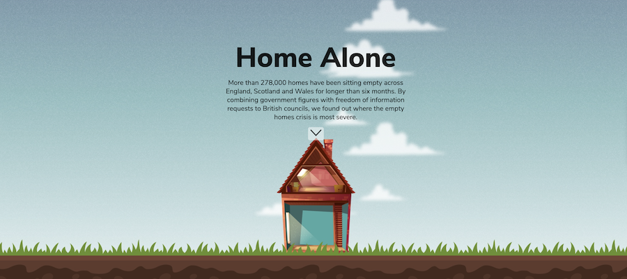
We then go on to discuss Home Alone – a serious campaign looking at the state of empty homes across Britain as part of the UK’s housing crisis.
Here we cover…
- The need to be more careful with non-trivial topics so that we give a fair representation of the data, e.g. when looking at government data as opposed to movie data
- Why it’s useful to consider if the data itself is interesting for a region, or whether it’s just the ranking – Otherwise it will only be the ones near the top (and maybe the bottom) that will care.
- How the proportional twist can safeguard against obvious winners and obvious losers – in Movie Mortality, as well as the actor who’s died most in movies, they also revealed who died most often in movies
James and I briefly disagree about who came up with the phrase ‘proportional twist’. We believe it came out of a conversation we’d had previously, but each of us thought the other person came up with it. So we’ll never know. But now I’ve got the mic – well, the keyboard – so for the record, it was James that came up with it, and that’s that! ;P
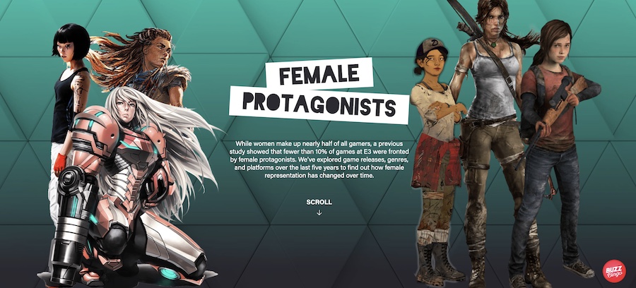
We also briefly discuss an idea James came up with for BuzzBingo, about the prevalence, or lack thereof, of female protagonists in video games.
We then go on to discuss…
Originality vs ‘Playing it Safe’
“The safest way to play it is to not play it too safe”
Sean Fitzsimons
Here we talk about…
- Whether anything can every be truly original or truly safe
- How you can aim for a certain benchmark of originality in each idea by finding a new twist
- How finding a new twist means there’s less risk of another agency doing the same thing – and the story will have a freshness for the press
- How James thinks about themes that will always resonate within a vertical but tries to figure out how they can “answer a question that hasn’t been answered before”
- And the importance of determining if that’s a question that needs to be answered at all
- How James never feels completely safe with an idea even if he’s done similar things before
- How James and Sean don’t really believe in the death of formats, especially if that format is the best way to tell the story you want to tell
- How it can be hard to differentiate yourself if everyone’s sending the journalist similar stuff
“Things are safe until they’re not”
James Barnes
When discussing popular formats (including surveys) James mentions that Aira did a story about rebranding Santa that cleaned up. And Verve did a simple sex survey for a health client that got links from the BBC.
Why Sean believes if you’re confident in the headline, you shouldn’t be too worried about the methodology – even if that is using a familiar format.
“The theories about formats being dead tend to lose sight of what the story is”
Sean Fitzsimons
Within this conversation we discuss some of the ‘most instagrammed’ campaigns including the selfiest city, the foodiest cities and the most instagrammed sneakers.
We discuss how new visual formats can carry weight in their infancy – e.g. drone footage, or virtual reality tours which Verve had success with back in the day.
And if a format is the perfect way to tell the story, it can still do well. But if you’re leaning on the format too much to carry you, it won’t work, because people have experienced these things before.
Like the Instagram thing. When it’s first done, it’s a novel way of doing it, but now the actual element that you’re looking at needs to carry the weight.
During this section, I mention some novel visual formats that turned old photos into HD or 3D (I struggled to find links to the things I was thinking of here – sorry!).
James talks about his favourite account on Twitter, called Babel Colour. And I briefly mention Sandtone by Rise at Seven.
We then go on to discuss…
The challenge of creating interesting surveys
- How they’ve struggled using surveys in the American health sector
- How COVID was an interesting time for surveys – to find out how people were responding to the social change
- How surveys might require more creativity, not less – even though they’re sometimes used as a crux when people are lacking ideas
- A loneliness scale that’s used in 80% of all scientific studies on loneliness
- How they used the scientific loneliness questionnaire as their survey questions
- How Sean generally likes to consider if there’s a scientific foundation for the questions they’re asking in surveys
- The value of thinking in advance how you’re going to present survey data
- The tension between data accuracy and reaching a compelling story
James mentions that Reboot did some clever surveys over the lockdown period.
And we end up briefly talking about another study that had sparked controversy online – in which the specific wording of the questions led to misleading headlines.
I wasn’t fully aware of what we were referring to here, but this article does a great job of examining the nuances of the data and the headlines.
And that just about covers it.
Eesh – that was a beast of a roundup!
I think I’ll have to make these shorter in future. They take quite a lot of time!
But anyway, for now…
I hope you enjoy the show!
Get the newsletter Join over 9,000 marketers
Get the FREE Ebook
